Upgrade to Dripsy v3
This version is a really exciting advance in the developer experience of Dripsy.
yarn add dripsyOnce you read about the new features, check out the Upgrade Guide.
While there are no breaking changes, there are many cool features to take advantage of (and it will only take a minute).
You can also check out the PR.
Features / Improvements 🥸
DX 👨🏽💻
- Add intellisense for
useDripsyTheme - Add intellisense for
sxprop - Add intellisense for
gradientandcolorson@dripsy/gradient - Add intellisense for
useResponsiveValue(theme => [theme.colors.background]) - Add intellisense for
useSx - Add intellisense for
sxfactory (sx={theme => ({ color: theme.colors.text })} - Add
makeThemefunction to override default one with a custom theme - Allow module declaration for merging TypeScript theme
- Remove
@theme-ui/core - Remove all Theme UI runtime code
- Use
@theme-ui/cssfor types only - Move
DripsyProviderto use internal Dripsy context rather than Theme UI (BREAKING if you use thejsxpragma in your app) - Add intellisense for
styledandmakeThemedComponent - Add intellisense for
themeKeyinstyled - Add intellisense for
variantandvariants - Make intellisense for
variantonly pick based on the specifiedthemeKey - Add scale-specific theme tokens. For instance,
backgroundColorshould only get tokens from thetheme.colors. (Is this blocking? It could take a lot of effort. Not sure if it should be blocking) - Allow arrays in the theme (is this blocking?)
- Map theme UI styles onto RN styles if the key exists (width can be a string on web, but not native, unless it's from the theme). Maybe we just add in all RN style options here.
- Add option to enforce strict types from RN styles mapped with theme (
paddingcan be$1from the theme and1, but not"1"if that's not in the theme) - Log error from Dripsy if you pass
""as a style? - Ensure that
Tokenizeis performant for large themes - Test in large monorepo
Performance 🦦
- Memoize
sxprop under the hood - Improve
Gradientmemoization
Features 🛩
- Add support for
Pressable's factorystyle={interaction => ({ ... })}prop - Add
textShadowsto theme - Add
shadowsto theme with RN style - Add
transformtosxprop - Add
boxShadowtosxprop with intellisense - Add
textShadowtosxprop with intellisense - Suport React Native 0.65
Upgrade Guide
Dripsy v3 is now available. The upgrade from v2 should take about 1 minute.
Install v3
yarn add dripsy## if you use this package, upgrade it too (ignore this for v4)yarn add @dripsy/gradientVersions
Make sure you have at least TypeScript 4.4+:
yarn add -D typescriptAdd makeTheme
All you have to do to upgrade is wrap your theme with makeTheme, and then use module declaration.
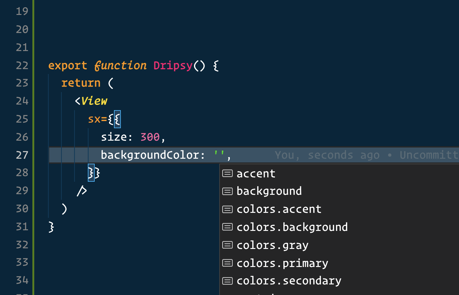
import { makeTheme } from 'dripsy'const theme = makeTheme({ colors: { primary: 'blue' },})type MyTheme = typeof themedeclare module 'dripsy' { // eslint-disable-next-line @typescript-eslint/no-empty-interface interface DripsyCustomTheme extends MyTheme {}}You now get intellisense 🥳
Gotchas
If you don't see autocomplete, there could be a few reasons.
- You need to restart VSCode (yeah, really)
- You might have an old version of TypeScript (you should use 4.4+).
yarn add -D typescript
Strict Types
If you want to enforce strict types for your sx prop, you can do so with the new theme.types field:
const theme = makeTheme({ // ...your theme here types: { onlyAllowThemeValues: 'always', // default: 'never' },})By setting types.onlyAllowThemeValues to always, you restrict yourself to only using theme values in your sx prop. While this may feel like overkill, it is a good pattern of enforcing consistent design.
This will only apply to theme values that are set. For example, if you haven't set the theme.space property, then strict types won't enforce for padding, margin, etc.
Incremental strict types
It's possible you want to implement strict types on a per-scale basis. The types.onlyAllowThemeValues also accepts an object with per-scale definitions.
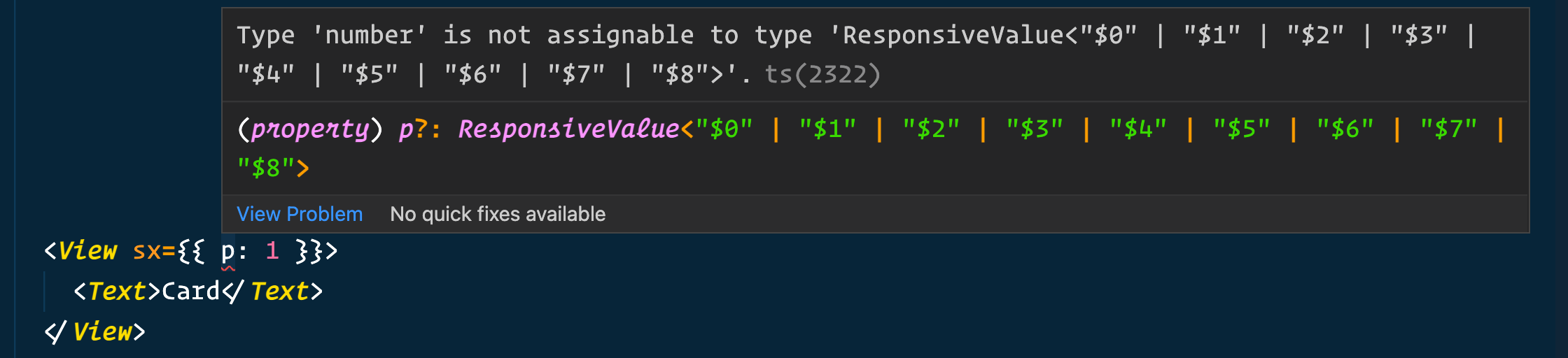
const theme = makeTheme({ space: { $0: 0, $1: 4, $2: 8, $3: 16, $4: 32, $5: 64, $6: 128, $7: 256, $8: 512, }, types: { onlyAllowThemeValues: { space: 'always', }, },})Now, our sx prop's space-related properties (such as margin, padding, etc) will only accept one of the values in theme.space. To take full advantage of this feature, it is recommended that you don't use arrays, and instead make a dictionary with $ prefixes, such as the space one above.
Recommendation
The strict types feature is especially useful if you want to upgrade to Dripsy 3, have no breaking changes with your types, but slowly transition your app to have stricter types.
It also makes changing your theme much easier. For example, imagine that you change your space from an array to a dictionary:
const theme = makeTheme({ // before space: [0, 4, 8, 16, 32, 64, 128, 256, 512], // after space: { $0: 0, $1: 4, $2: 8, $3: 16, $4: 32, $5: 64, $6: 128, $7: 256, $8: 512, },})After changing your theme.space, you likely have hundreds of invalid styles throughout your app. Finding them all would be a mess.
However, with incremental strict types, you could achieve this code refactor in seconds.
const theme = makeTheme({ // before space: [0, 4, 8, 16, 32, 64, 128, 256, 512], // after space: { $0: 0, $1: 4, $2: 8, $3: 16, $4: 32, $5: 64, $6: 128, $7: 256, $8: 512, }, types: { onlyAllowThemeValues: { space: 'always', }, },})Now, simply run your TypeScript type-checker (yarn tsc --noEmit) to see all the places you need to update. You'll get useful errors like this:
If you want an escape hatch that lets you style without theme keys without disabling strict types, use the
styleprop instead ofsx.
Enforce React Native types
default: false
const theme = makeTheme({ // ... theme types: { reactNativeTypesOnly: true, // default false },})If you set this field to true, then you can only pass styles that fit a React Native style object.
For example, on web, you can set fontWeight as a number, like so: fontWeight: 400. With React Native, font weights must be strings (fontWeight: '400'). Using a number here would probably work with dripsy if you've utilized the customFonts feature in your theme.
I recommend setting this field to true. However, it will default to false to avoid breaking changes with users who are on v2 (like me) who don't want to refactor everywhere. If your app is just adding Dripsy, you should set this field to true. And it may work to set it to true either way. If it riddles your type checker with errors, then you can easily disable it.
To clarify: when this is false, it will allow either theme-ui types for a given field, or React Native types. When it's set to true, it will only allow React Native types (if they exist.)
Since React Native has no cursor property, for instance, using this field will always pull from the theme-ui web types.
Breaking Changes
There are essentially no breaking changes.
If you are a very advanced user with a custom setup, this might be breaking for you:
Removed
@theme-ui/coredependency- For 99% of people, this won't matter. You likely didn't even know about this dependency. If that's the case, ignore this.
- However, if you were using a very custom (undocumented) Dripsy setup with
theme-uion web, you'll need to wrap your app withtheme-ui'sThemeProvideryourself. Previously, Dripsy used that provider under the hood.
Removed
Buttoncomponent (just import it fromreact-nativeinstead ofdripsy)
Array values
If your theme had any array values, turn them into objects.
Arrays in theme were added to v3.